• Client: Truckzy
  • Country: US
  • Industry: Transportation and logistics / SaaS / Start-up
  • Our roles: Brand & Visual identity, Website design
  • Year: 2022

Driving hard
could be simple!

Our marketing team designed a striking brand and visual identity to differentiate this start-up from its competitors and give a wind at these amazing guys back! Having a great experience with developing and growing our own start-ups we know how a strong branding and logo design could make a difference and helps you sell more!

  • Client: Truckzy
  • Country: US
  • Industry: Transportation and logistics / SaaS / Start-up
  • Our roles: Brand & Visual identity, Website design
  • Year: 2022

Driving hard
could be simple!

Our marketing team designed a striking brand and visual identity to differentiate this start-up from its competitors and give a wind at these amazing guys back! Having a great experience with developing and growing our own start-ups we know how a strong branding and logo design could make a difference and helps you sell more!

Drive Hard. Organize Easy.

01 Our Partner

Truckzy is a start-up based in the US. Their customers describe Truckzy as a fleet management solution, accounting software for trucking companies, invoicing service, and/or collaborative tool for charting delivery routes… the truth is – Truckzy is all of these and much more!

This SaaS is a result of an amazing team who have spent years in the trucking business and believe that all small to mid-size businesses in the trucking industry should focus on the core of their business: to drive and deliver the goods efficiently!

The project was started in 2020 and was launched in 2021 when the first business users were acquired (strictly as a software solution). These trucking companies provided enough feedback to develop the upgrades necessary for providing a one-stop-shop digital solution, that would help all small and mid-sized trucking companies around the world!

Truckzy believes that data should be easily organized, digitized, easily accessible for everyone, and at an affordable price, without any large upfront costs and investments.

Thus, their mission is to cut the countless hours on administration and paperwork and to help owners and managers grow their businesses fast by providing them with real-time data that lead to data-driven decisions. These numbers become even more valuable over time as the company grows.

truckzy-img2

03 The Challenge

This software solution needed a name, domain, logo, tagline, and complete branding and visuals to help them to connect with their target audience – small to mid sizes trucking companies mainly located in the US – through several different channels.

This may sound easy, but along the way we’ve found out that these guys needed more than just a logo or simple branding… they were willing to find a real partner that will help them tell their story visually!

truckzy-img3
truckzy-img4
truckzy-img5

03 Our Approach

From the very beginning, we’ve established a strategy to develop a powerful brand identity! Our ultimate goal was to learn more about our clients and their software solution, to learn more about their target audience, and how they want to be perceived! We’ve also done competitors’ research, created brand personas, and put everything together.

What we’ve learned during our journey resulted in creating a brand identity that is simple, clear, subtle, and honest!

Our ultimate goal was to create less and deliver more!

truckzy-img6

04 The Outcome

truckzy-img7
truckzy-img8

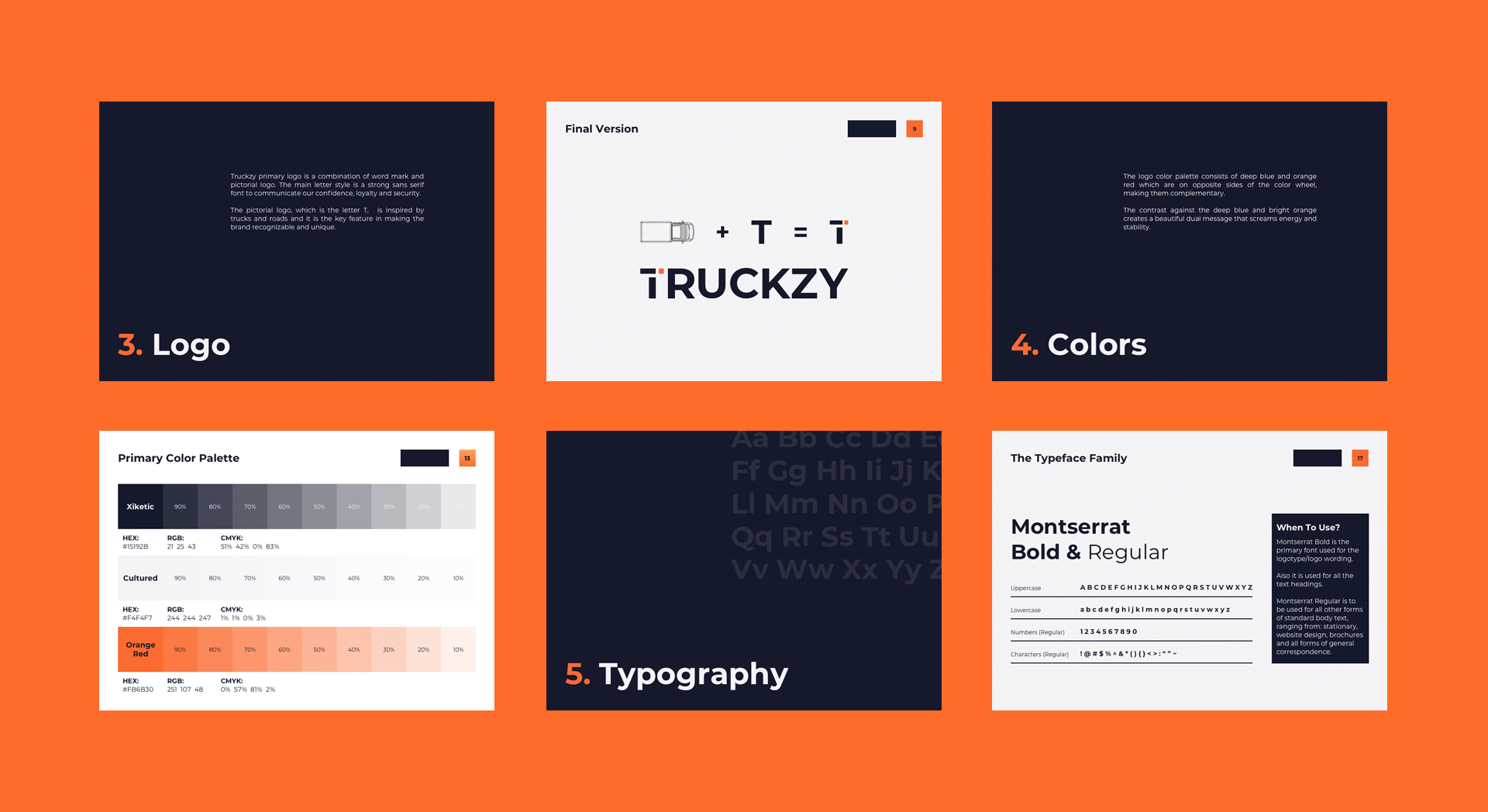
Truckzy’s primary logo is a combination of a word mark and a pictorial logo. The main letter style is a strong sans serif font to communicate our confidence, loyalty and security.

The pictorial logo is inspired by trucks and roads and it is the key feature in making the brand recognizable and unique. We’ve used sharp shapes, rectangles, squares, and straight lines to impact the sense of order in the brand.

truckzy-img9

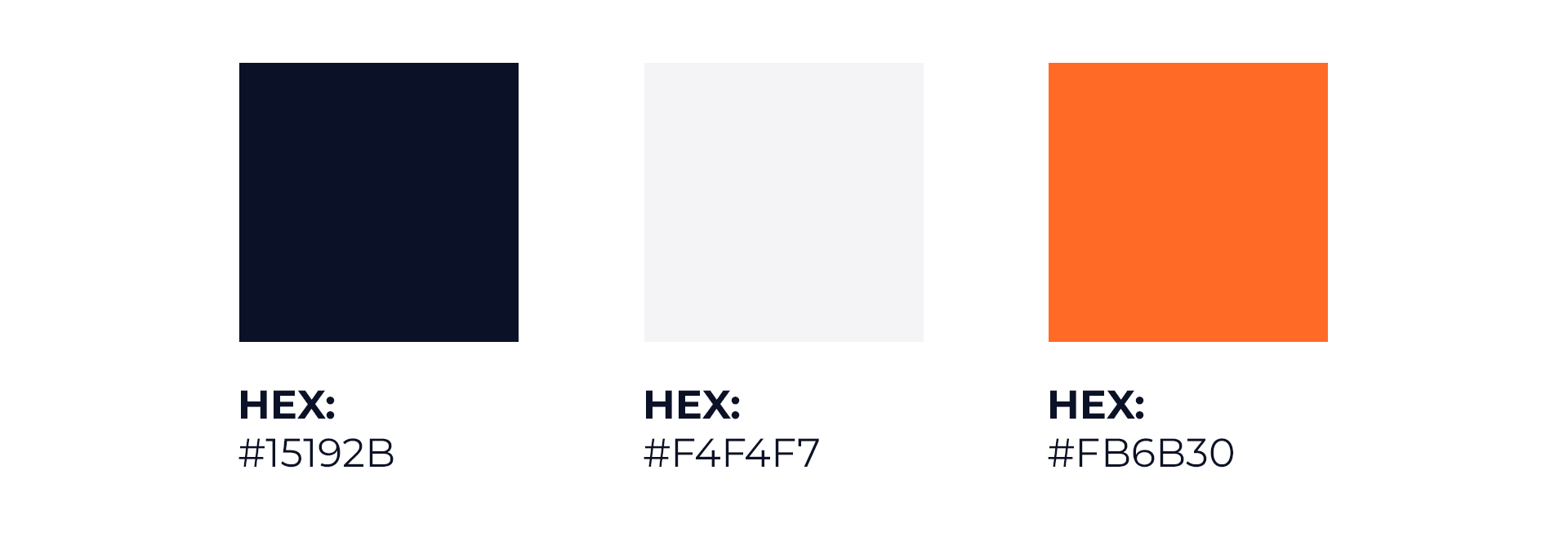
The logo color palette consists of deep blue and orange-red, carefully choose complementary colors that create an impactful color scheme and have a powerful psychological effect! The contrast between these two colors creates a beautiful dual message that screams energy and stability.

We’ve chosen a color scheme that is in line with the company’s mission and values while strengthening the brand voice and anything between that portrays what Truckzy is all about!

truckzy-img10

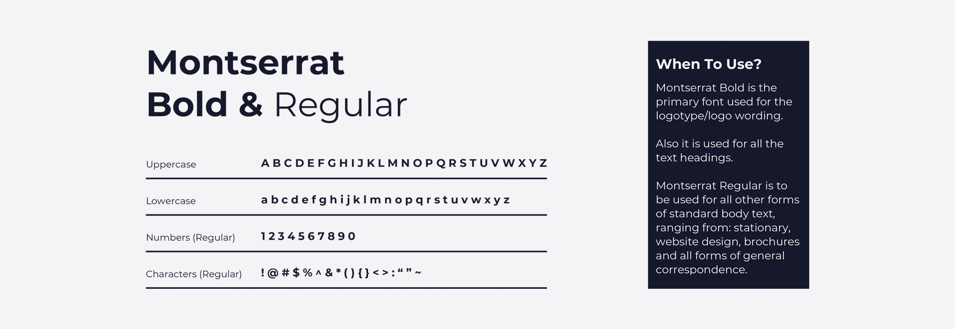
Truckzy is an innovative and modern way of conducting business! It is simple and it is humble! Thus, a modern and minimalist font that has an orderly and clean appearance was the most important factor when we were choosing the right typeface for Truckzy.

The choice was made – Monserat! Monserat is a sans-serif typeface from a geometric font family.

Montserrat Bold is the primary font used for the logotype/logo wording. Also, it is used for all the text headings. Montserrat Regular is to be used for all other forms of standard body text, ranging from stationary, website design, brochures, and all forms of general correspondence.

truckzy-img11
truckzy-img12
truckzy-img13
truckzy-img14

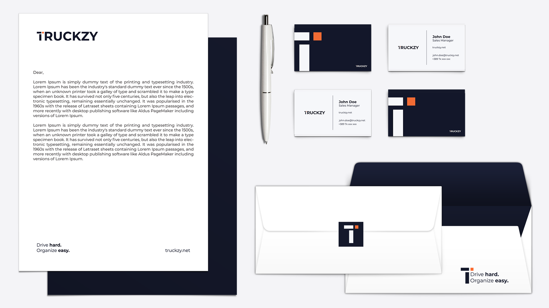
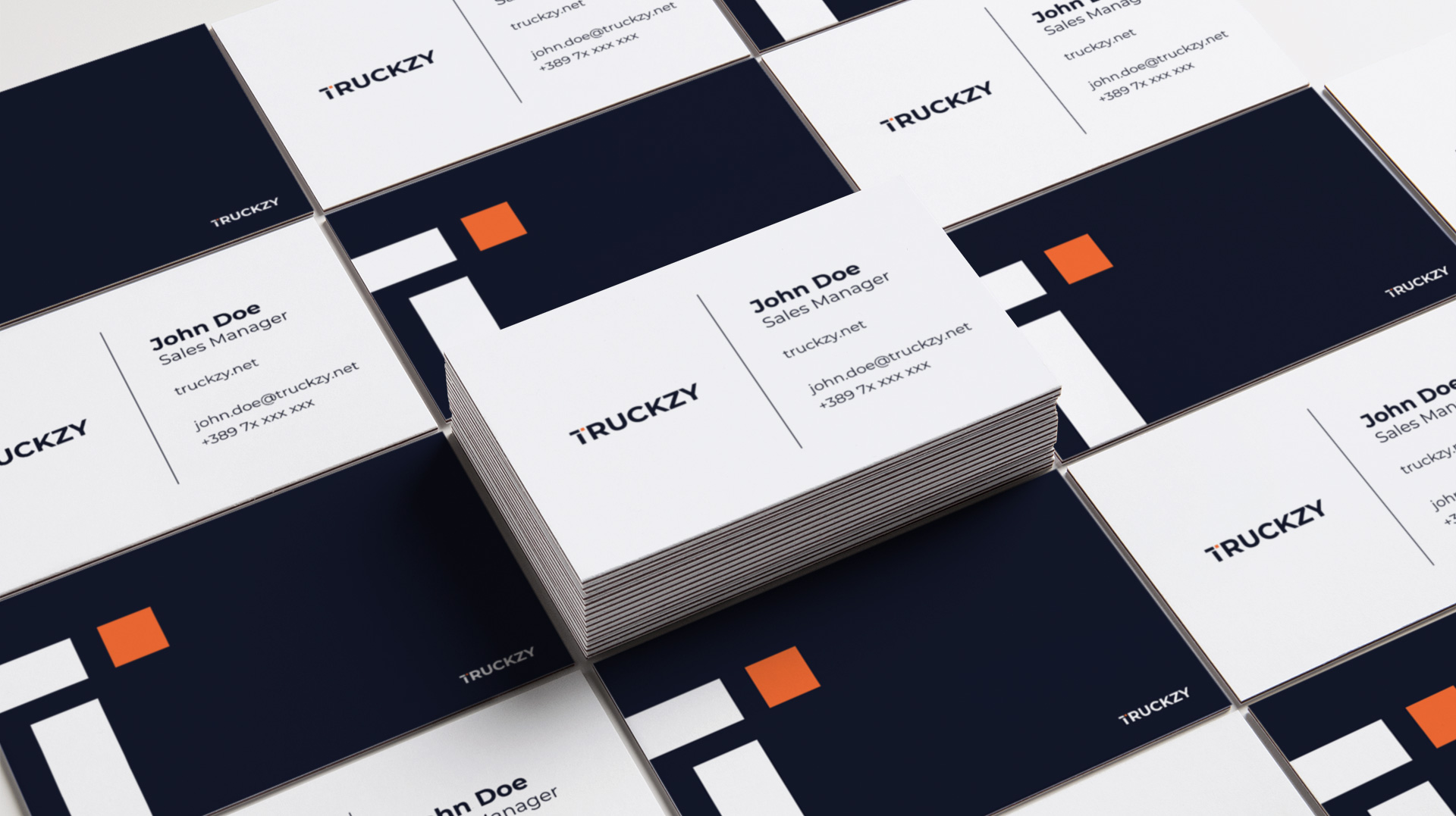
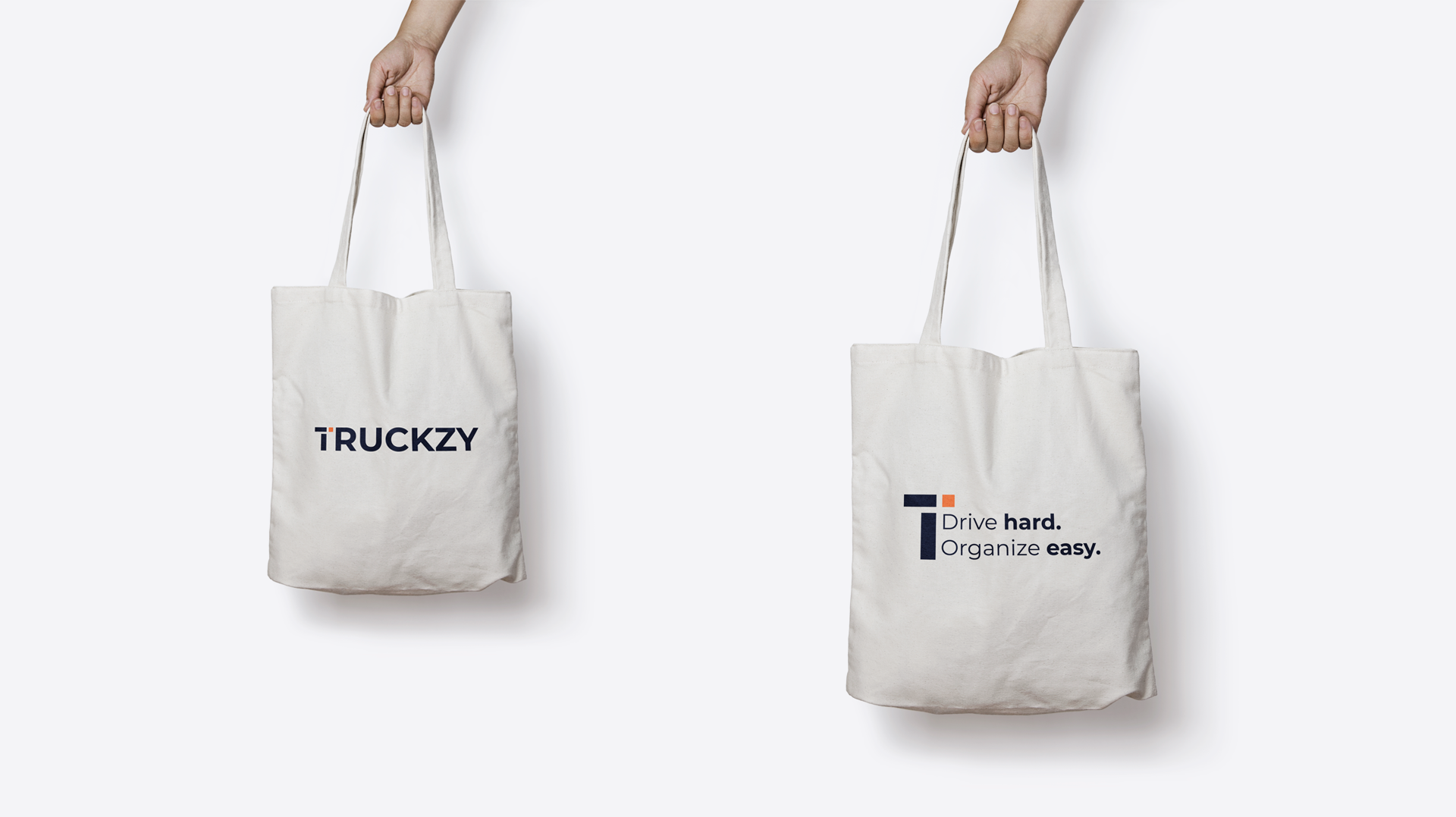
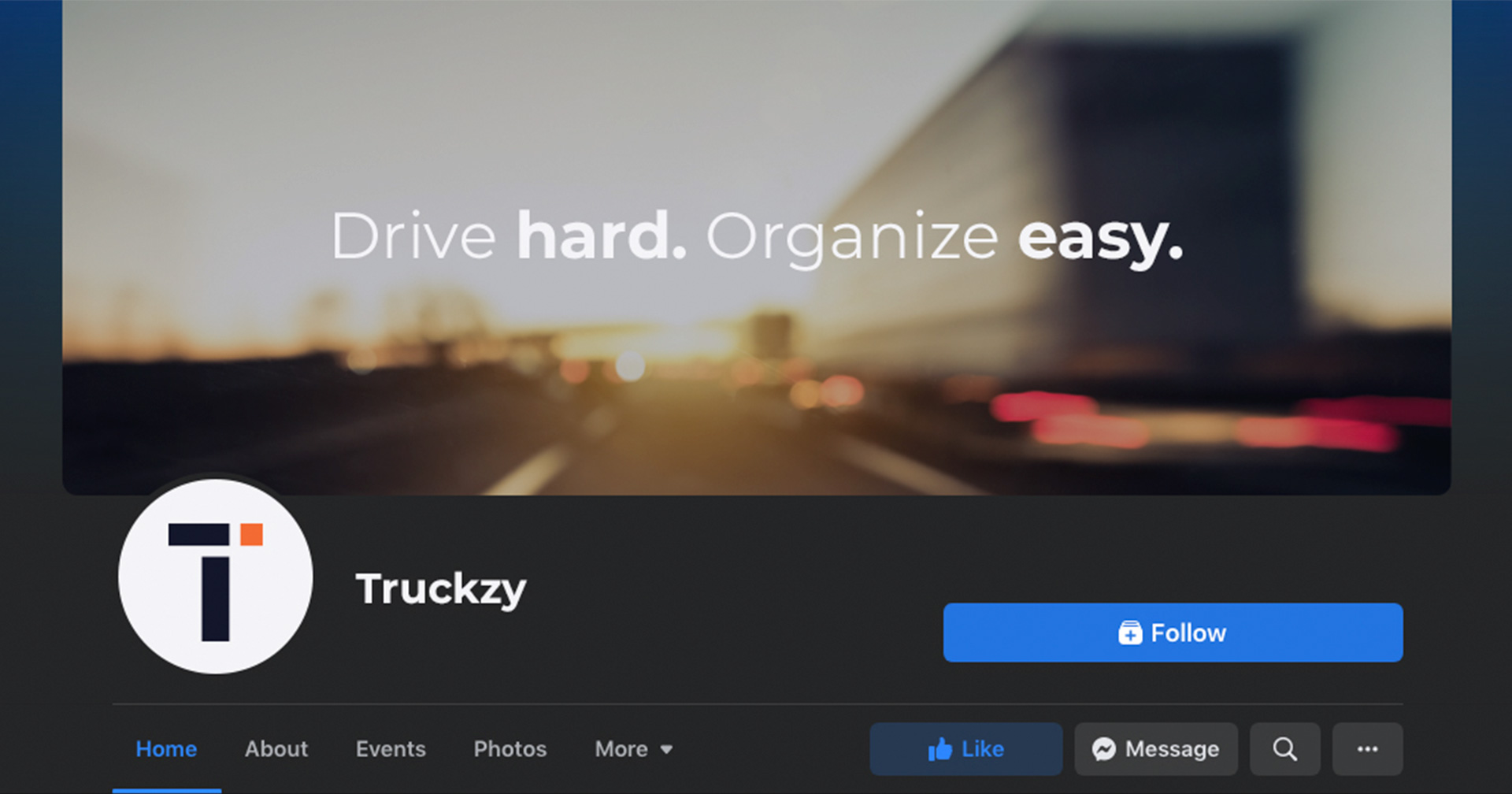
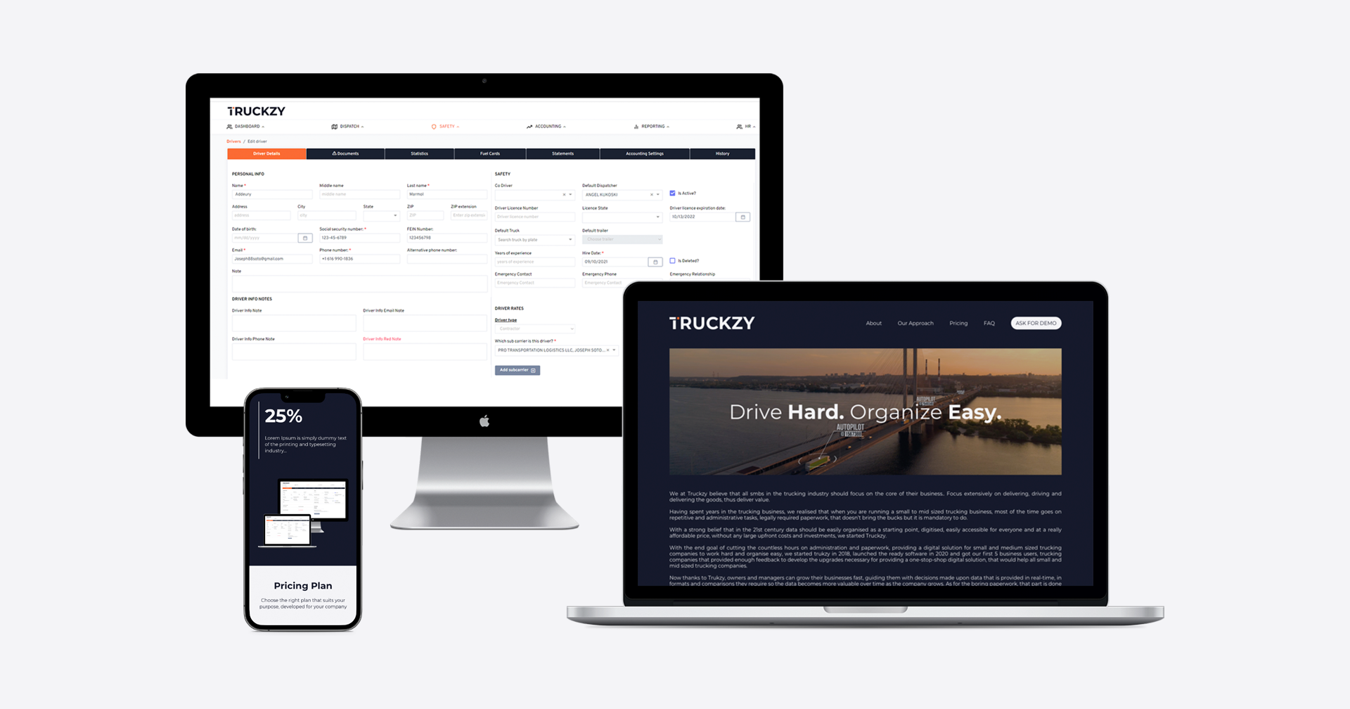
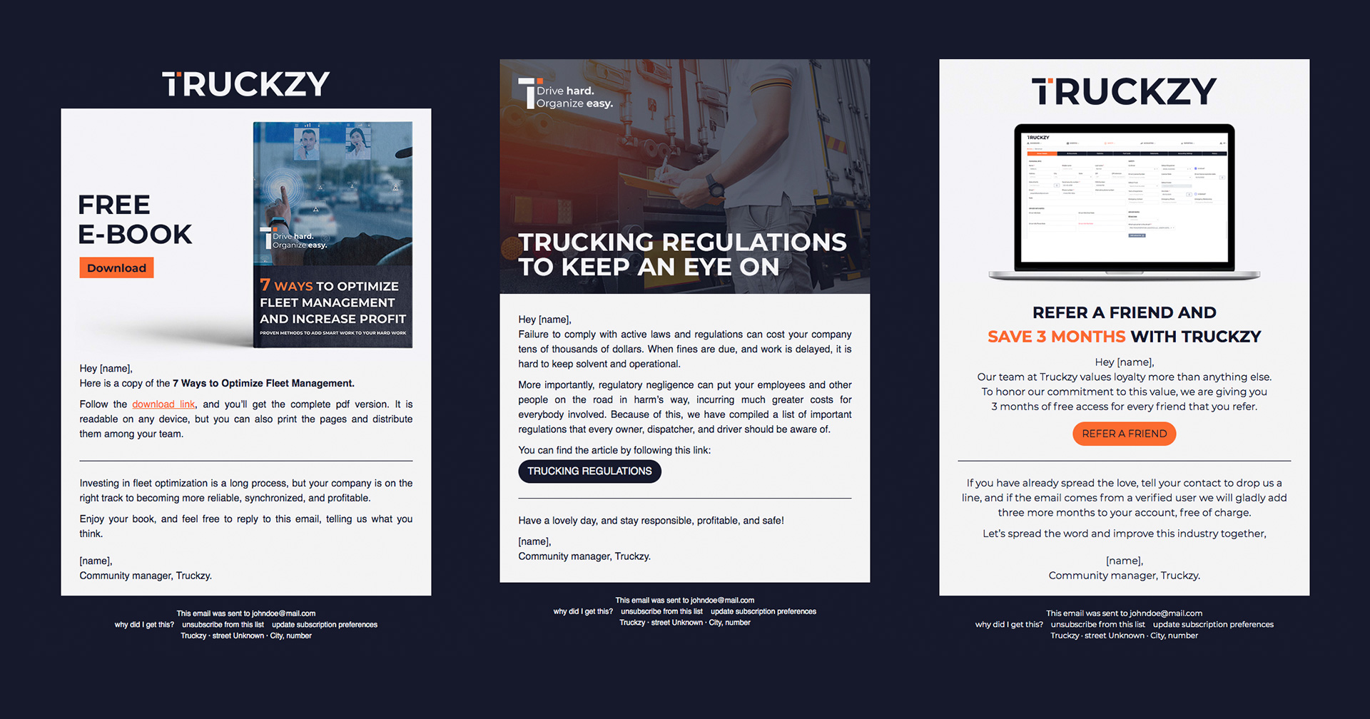
Website, landing pages, business cards, envelopes, bags, letterhead, e-book covers, newsletters, posters, and social media designs were created! Designs that will spark curiosity and support the sales team.

truckzy-img15
truckzy-img16
truckzy-img17

Next case study.

Ready to elevate your digital brand experience?
Schedule a meeting with our team to get started.

Schedule now